When that time arrives that two person decide to get married and spend the rest of their lives (luckily) together, a lot of challenges suddenly came up and need to be addressed in the most efficient way possible.
The invitation card is clearly one of those things that could be considered important for some people but its relevance could also be underestimated by many. Our point of view is that the Wedding Invitation is like a business card or a presentation, where the spirit, style, aesthetics and tone of the wedding should be conveyed.
Currently we can distinguish among several trends in terms of Wedding Invitations designs. However, we decided to focus on 2 styles that we consider interesting and trendy. Those are:
- 1) Luxury (Elegant)
- 2) Modern Retro
We will be working with Adobe Illustrator CS6 (basic skills are required and taken from granted), Free Vectors Graphics from the Vector Open Stock database and free fonts from Google Fonts.
Vector graphics will provide us various types of useful elements like Backgrounds, Ornaments, Silhouettes, Icons and more.
Ready? here we go.
Elegant/Luxury Wedding Invitation
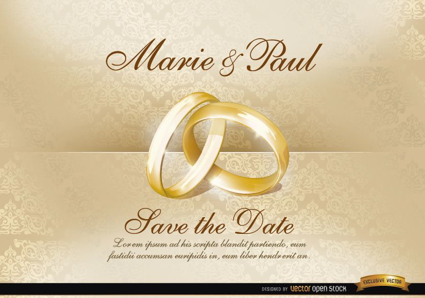
First Let’s find a background that we like, fits the Elegant/Luxury style and matches the personalities of the Groom and the Bride.
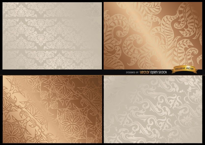
Here are some alternatives for the background:
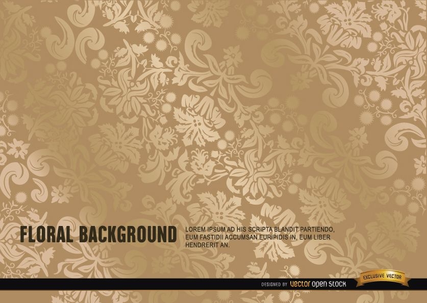
In this case we will use as a background the following vector:
We will remove the text, title and the brand stripe to have the clean background.
Now we will unlock all the objects (objects > unlock all).
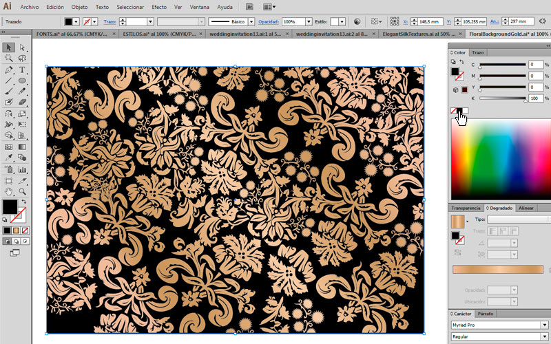
After that we will select the Background rectangle and turn it into black colour:
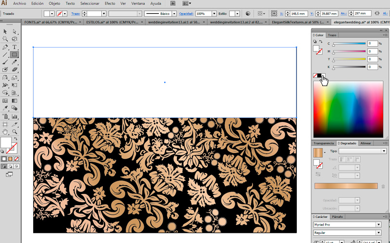
Now we will create a white rectangle that covers about 1/3 of the image, as shown:
Select the floral shapes and will apply a gradient with 3 anchors, in the gradient tool you will have to choose 40% black for both left and right extremes and in the middle a 20% black, check the direction of the gradient in the image:
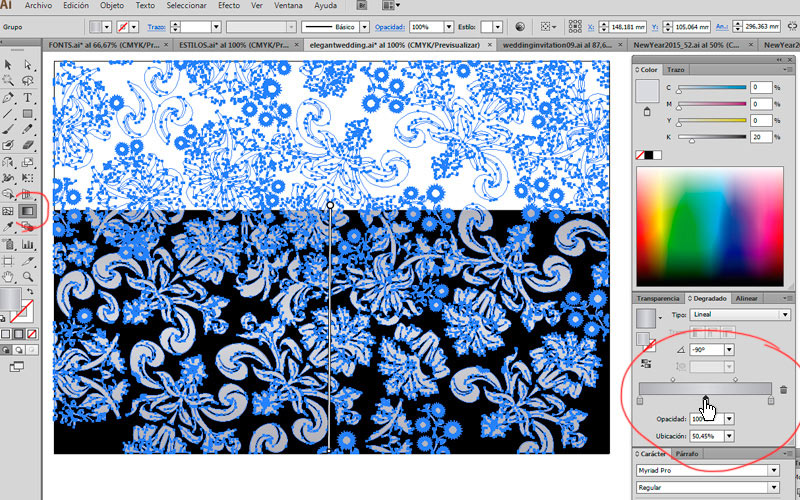
You can go also for a Golden look!
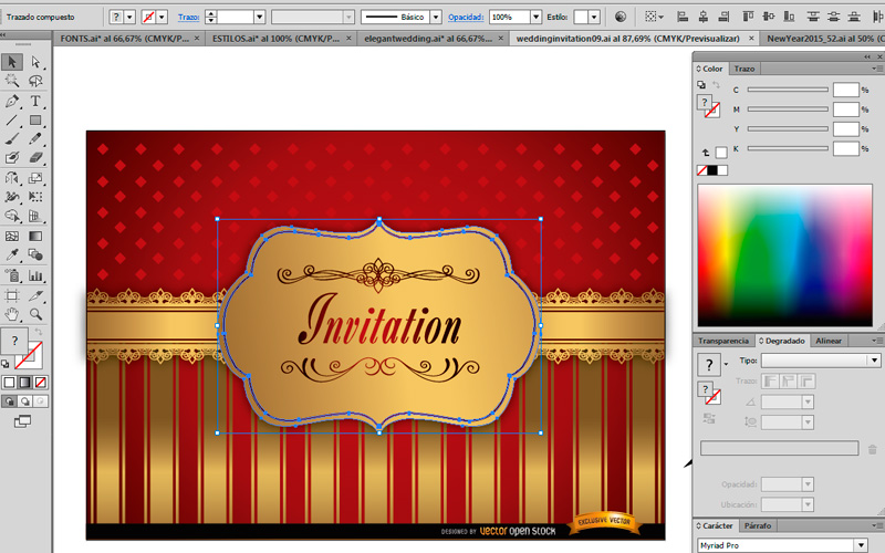
Then from the following vector that can be downloaded here we will copy the middle label/emblem (including boarders) where we will place the names of the Bride and the Groom.
Then we will be pasting the emblem/label in our current design, in the middle, so that it covers part of the background pattern and part of the white background, that will give it a outstanding look:
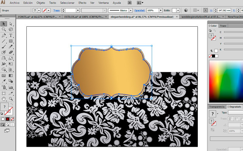
Make sure to align in the horizontal center
Now we’ll change the colours of the emblem/label to black and white. Let’s make the black inner boarder line white and the rest black.
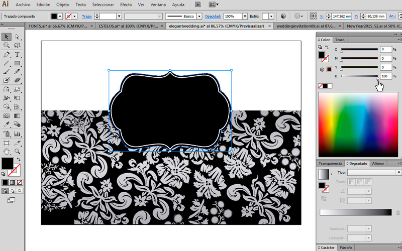
Try other colour combinations!
The following step is to add a black stripe between the floral background and the white space to separate and give it a more appealing look.
It’s now time for the names, in this case we’ve chosen a beautiful font that matches the stylish design, the font we used is called Great Vibes you can download it on the link, check how nice this is looking:
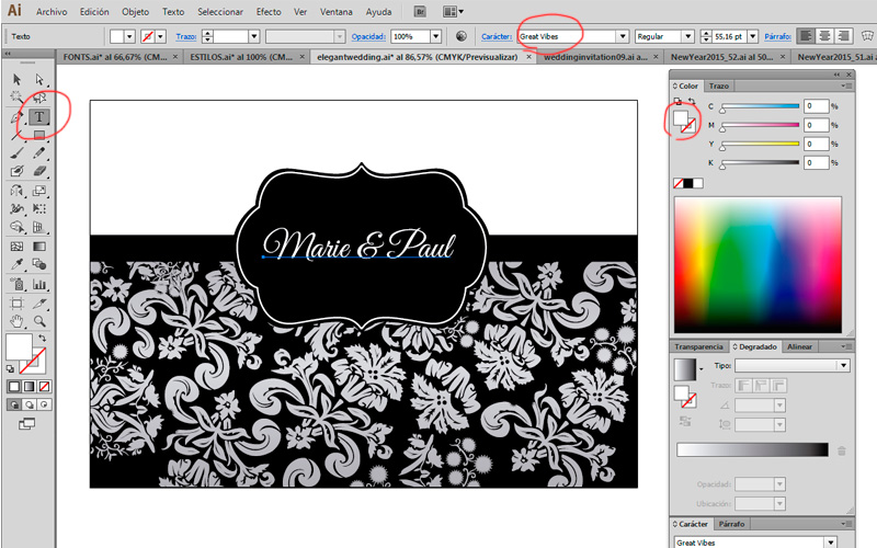
Script fonts matches perfectly elegant designs
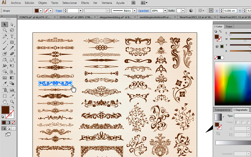
Well, it seems we need some ornaments to decorate around the names. That’s why we will go to one of our most popular vector files:
60 Floral swirls Ornaments and dividers set
You can choose among those 60 nice ornaments to decorate names, we decided to go with the selected one and paste it in the emblem/label like it’s shown in the image:
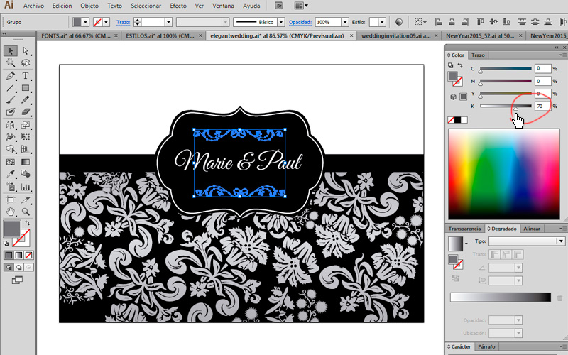
Customize your design with your favourite ornament!
Finally, the white part looks kind of empty, so we decided to give the white rectangle a transparency of 90% of opacity:
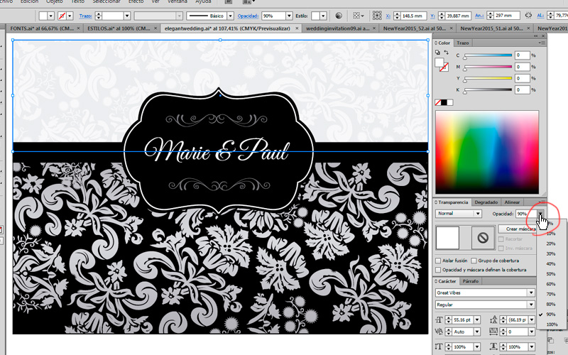
Almost done!
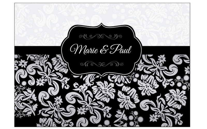
Walla! Here it’s

The finished vector can be downloaded here
Clearly the look of the upper part of our Invitation is taken to a highest level with this last tweak.
Too classy for you? You may prefer the next style:
Modern Retro Wedding Invitation
You may think that Modern and Retro are opposite. However, the retro or vintage look we used today is “modernized” to match the current design trends. Look can be approached by many ways, we would say that decisive elements when trying to look retro are fonts and colours. So we’ll have special attention to that. BTW, here’s an interesting article where you can find retro fonts
This time we will be using the Amatic SC font.
So, here we go again.
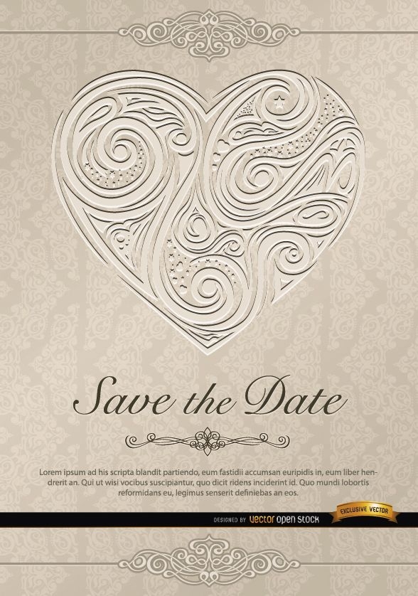
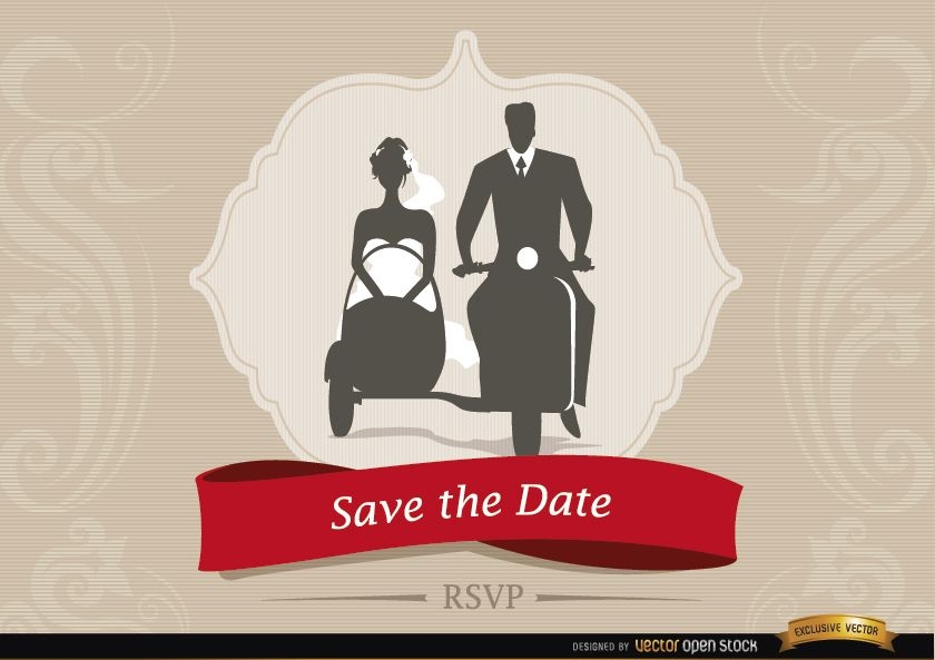
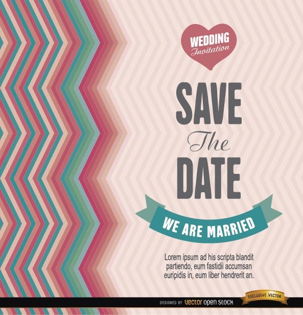
For this design we will be using 2 vectors from Vector Open Stock database:
So, here’s what we are going to do. We’ll take the background of the second vector file which looks kind of retro but modern. Copy the Background and paste it in a new document where we will be working on. We will be using the zig zag background horizontally instead of vertically. Rotate the background so it looks like this:
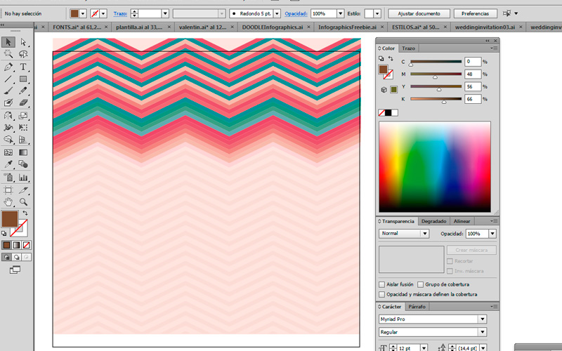
90 degrees!
Now we will repeat the upper part of the design so that it covers all our Artboard:
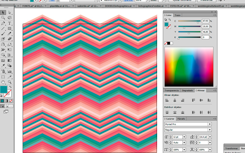
Psychodelic!!
Draw a rectangle that covers all the area and select both, the rectangle and the background, right click (secondary button for mac) and select “create clipping mask”, this will enclose the background on the rectangle we just created.
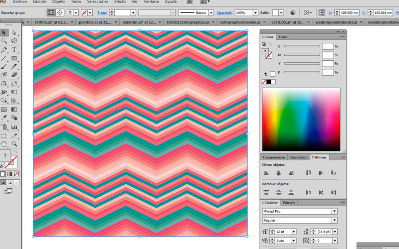 We will take the heart from the original design, and make it bigger, paste it in our new design:
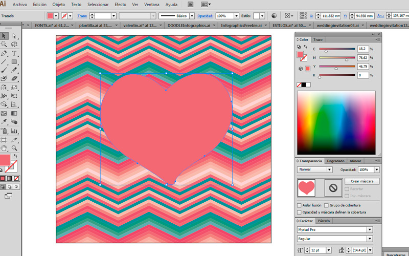
Make sure alignment is right!
Then we will select any of the colours from the background that could be the one you like the most, here we’ve chosen a light pink.
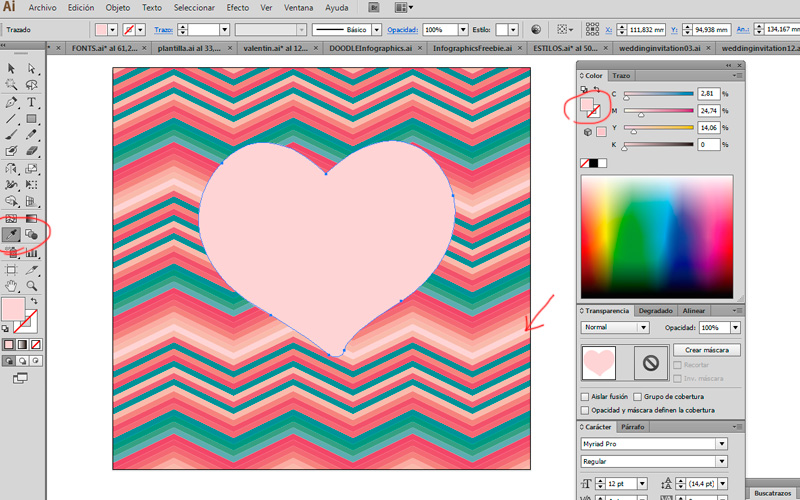
Clearer Heart to make it out stand!
We need a stroke to make it pop out better, so we will select the shape and select a 6pt grey stroke:
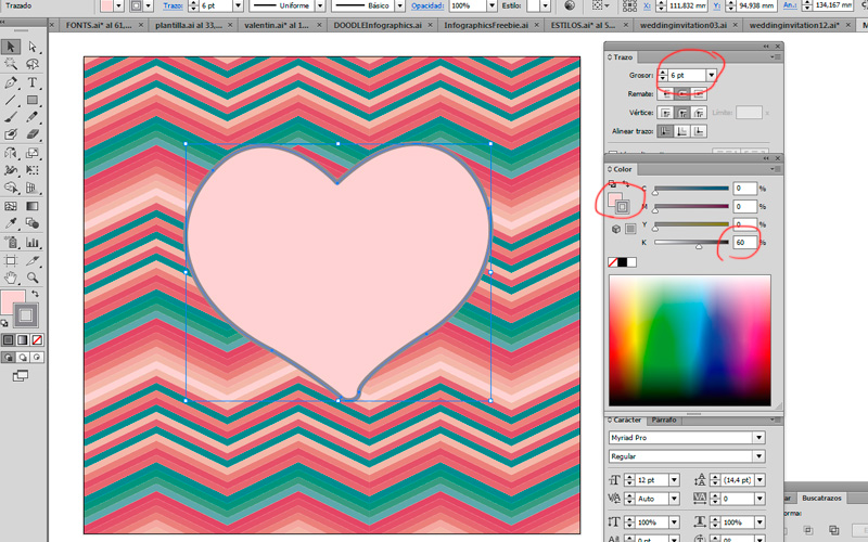
Grey Stroke
From the other vector, copy the sidercar with the couple and paste it inside the heart:
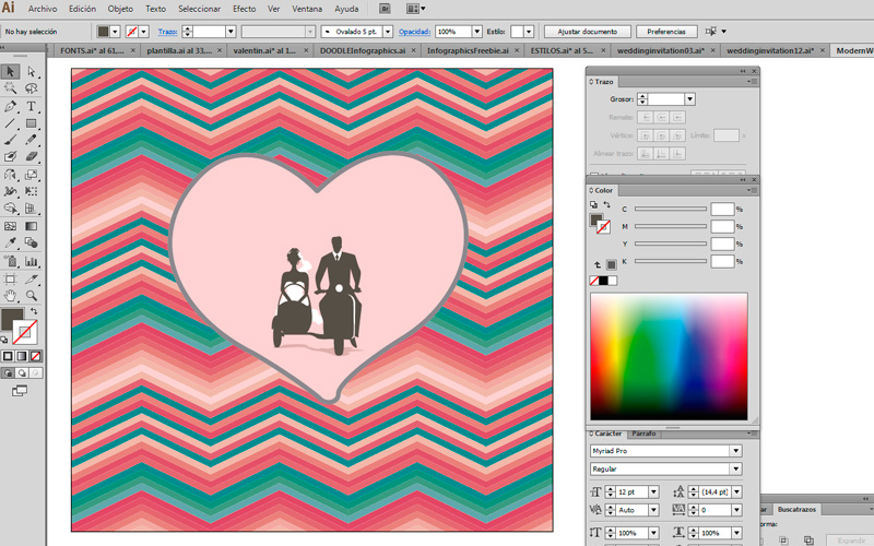
Leave space for names!
It’s time for the names, make sure to have the Amatic SC font installed in your system, we will use the same colour from the sidecar.
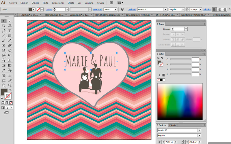
Download font here
We will use the green ribbon we had in the original design to write the message, that could be “we are getting married”, the date of the event or even a love quote.
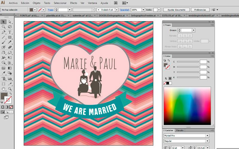
They are already married!!!
This little tweak will give the ribbon a 3D look, we’ll darken the sides of the ribbon:
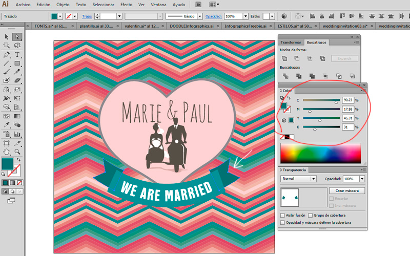
Give it a 3D feel
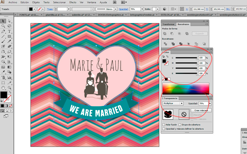
Now we are going to add a shadow to the design so it pops out. To do so we will select both shapes the ribbon and the heart and we will press ctrl+c and ctrl+b (command+c and command+b for mac), this copy and paste in the same place. The shape will stay selected and we will use the pathfinder to unite both shapes so that we can make the shadow with a single shape:
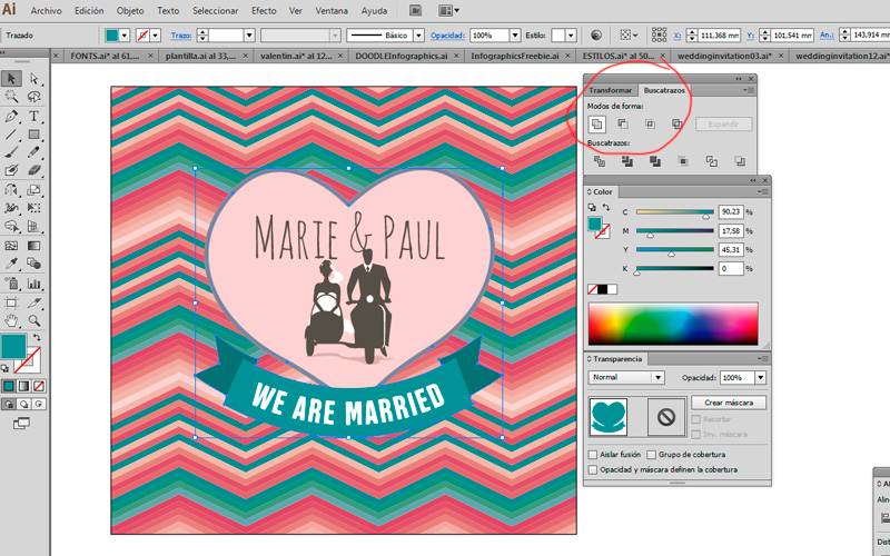
If the Pathfinder is not visible go to Window>Pathfinder!
Now with the behind shape selected we will go to effect and gaussian blur (40%). And then we will set colours and transparency as shown here. Make sure to use the multiply transparency:
Once again! We’re done! Looks good, doesn’t it?
If you are really lazy you can download the file directly clicking on the image! We would have say it at the beginning what you wouldn’t have learnt some useful tips shown here 🙂
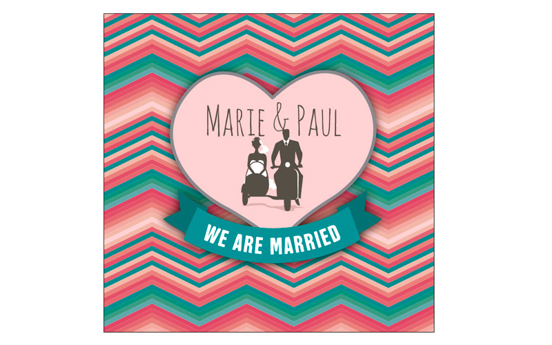
Download the final file here!
We hope you’ve enjoyed this tutorial. Comment and share is a way of saying thanks!
Have fun!

