Guest post by Samuel Caverly

Symmetry is a central feature of countless famous logo designs. The iconic McDonald’s arches and the Starbucks siren are perfect in their left-right bilateral symmetry, and the Target logo and British Petroleum logo take Audi haveit a step further with perfect rotational symmetry. It may be easier to design a logo with symmetry but that’s not the sole purpose of symmetry in brand logos. Symmetry is a fundamental part of nature and, when used in a logo, it is a powerful tool for shaping the way customers perceive a brand or company.
Symmetry’s role in nature and human perception will be discussed below, followed by how it is used in logo designs such as the UPS logo, the Adidas logo, and the new Nintendo Switch logo.
[Download Editable Logo Templates or use our Online Logo Maker here! – Fully Customizable Logo Designs for your Brand]

Symmetry and Marketing
Symmetry’s role in logo design isn’t as simple as it seems to be in human anatomy. It’s more than just “more symmetry is always better.” If it were, then every logo would just be perfectly symmetrical and the world of logo design might actually be a bit boring. Instead, companies use different levels of symmetry in their logos in order to communicate certain ideas that they want to associate with their brands.
Some symmetry is important in order to maintain a balanced logo that is visually appealing, but adding asymmetry to a logo can convey important meaning to customers. The importance of symmetry and asymmetry can be tricky to understand but it is crucial to logo design.
Some designers like to associate symmetry with perfection or craftsmanship and asymmetry with genuineness or humanity. Because of this, a lot of car companies such as Volkswagen, Mercedes, Honda, Toyota, and Audi have symmetrical logos and also place craftsmanship and engineering at the center of their advertising strategy. Meanwhile, companies such as Nike, Facebook, and Apple use asymmetrical logos and often promote their more human attributes in their marketing strategy.
What Is a Transparent Logo and How to Create One? Logaster.com help to create transparent customized logos for brand online, read the article to know how to make a logo transparent in Photoshop by yourself in a few minutes.
So how has symmetry been used to varying degrees in famous logo designs?
UPS Logo

UPS’s logo is a great example of how to effectively balance the use of symmetrical and asymmetrical design. The outline of the logo (the shield) has perfect bilateral symmetry which evokes thoughts of sophistication, engineering, and efficiency, all important attributes for a customer who wants their package delivered on time. However, the internal design of the logo is slightly asymmetrical giving it a more human feel. This human feel might help to remind customers that the package won’t just be delivered on time but that it will also be delivered with a smile.
Adidas Logo

For much of Adidas’s history they used a bilaterally symmetrical trefoil logo, but they recently added a new asymmetrical logo based on the outline of a mountain. What is especially interesting is that Adidas still uses the old trefoil logo on their so-called classic products while using the asymmetrical logo on their newer high-performance wear. This lines up well with the theories explored above. Symmetry creates the classical, sophisticated feel. Asymmetry creates the high-performance, exciting feel.
Nintendo Switch Logo

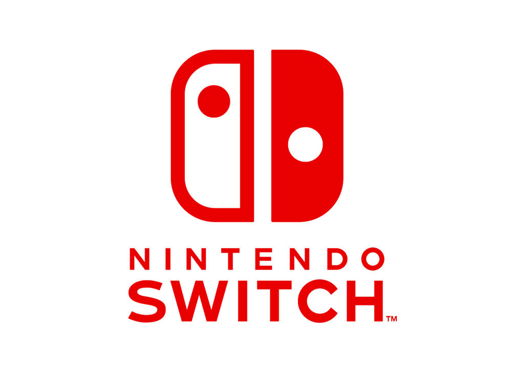
The Nintendo Switch logo has received a lot of press recently for its strange approach to symmetry. The logo might look fairly symmetric but it’s actually not. The dots on either side aren’t symmetric with each other, and the two halves themselves are actually of different sizes. Nintendo created such a lopsided logo in order to make up for the differing visual weights of the logo’s various elements. That the logo comes out looking symmetric and balanced just goes to show that, while important, there’s more to logos than mere symmetry.
Symmetry is a simple tool that conveys complex information to customers when used appropriately. Many famous logo designs expertly utilize symmetry and asymmetry to subtly influence their customers, and understanding this phenomenon is crucial for any marketer, designer, or even customer.


